I know others in the community have been outspoken about the design of the website, so I decided to take a swing at it. I run a marketing agency and have design resources in-house. I started with the homepage, got feedback from a few key RP community members throughout the process, and this is what came back. See the attached screenshots. My notes:
Please excuse any small typos or alignment issues, just a mockup and didn’t want to waste any more time getting this out there.
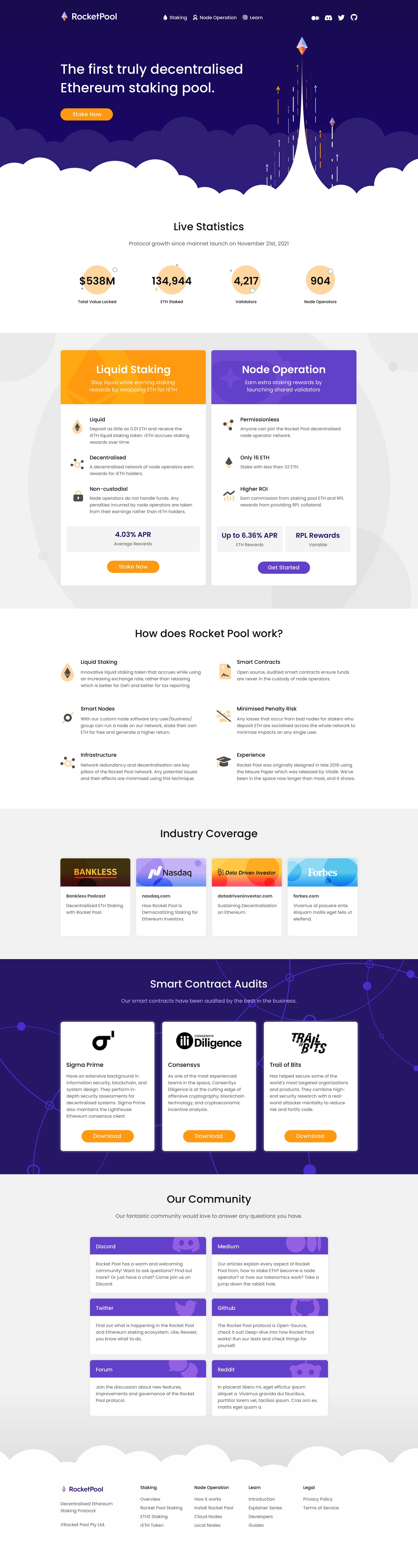
Overall goal was to create a much cleaner design while still retaining unique brand elements. It needs to be more professional to attract larger institutional stakers, but it also needs to retain and display the personality of a grassroots community.
The copy I wrote isn’t perfect but attempts to be more direct and to drive action.
We made two versions of the main illustration, one with the rETH logos on the left side, and one with the normal ETH logos.
So with that said - I wanted to stop here and get a pulse from the community before going further.
I think this is an improvement over the current design. Yet I’m not a fan of the big rocket. I think it’s too playful. We should aim for a more respectable and professional look.
I’m 100% open to any/all changes here. The goal of the hero illustration is to give a basic understanding of what the protocol does (as best as we possibly can). With “Rocket” being in the name, thought it was a natural place to start, also because users are “launching” validators. But, open to any/all alternatives if you / anyone else has specific ideas.
Good job! It’s definitely an improvement. I would highlight two things:
Rather than highlighting both, stakers and node operators, I would give preference to stakers (a landing page with the swap tool directly) and leave node operators a secondary position.
Then, there’s info about tax advantages. Considering that this is a global project, this info may too specific for USA.
Rather than highlighting both, stakers and node operators, I would give preference to stakers (a landing page with the swap tool directly) and leave node operators a secondary position.
I’m a bit torn here, as I feel what’s been holding the protocol back since about Month #2 is not enough node operators / the staking queue being consistently full. But from a marketing perspective, I do agree that it might be a better idea to choose one type of protocol participant to prioritize on the website for the sake of driving action.
Then, there’s info about tax advantages. Considering that this is a global project, this info may too specific for USA.
We could change “most” to “some” in the copy? I know for a fair amount of other NOs, the tax advantages did make a compelling difference going that route than going ETH → rETH. But you’re totally right, it’s a global protocol, we can choose better language to reflect that.
Welp, I guess I’ll table this based off the lack of engagement.
I check the DAO forum periodically but if I don’t get back to a new comment in a timely manner and you would like to collaborate/talk further, email me at [email protected].
I like your design, I think it’s great. It’s nice, clean and very professional.
But I like the current Rocket Pool name, logo, orange color and website more. It’s fun, memorable and most importantly it has a soul.
I don’t think it needs to be redesigned. I don’t recall ever understanding what a crypto project is and what it does by reading its landing page. I never have the prerequisite knowledge to understand everything anyway and most of the time l visit the home page just to click the link to go the app. I don’t think it needs to be perfect, so changing the website is just bikeshedding in my opinion.
I disagree, the current website looks almost like a scam if you didn’t know better. Professional design portrays (and, to a small extent, even proves) legitimacy/competency. Combined with the name containing “Rocket” which may seem like a meme “moon coin” type thing to newcomers, I think it’s even more important to portray our legitimacy
I would have to agree with wasserbrunner, the current website and branding does not come off as professional at all and desperately needs to be reworked.
I disagree with peteris that the first impression that people get from the website & other marketing material will not persuade them one way or the other. There are many that are interested in staking, but do not necessarily have the time or desire to do extensive research on all available options. People will naturally gravitate towards designs that instill legitimacy, this especially being the case when money is involved. IMO It’s a mistake to assume people will go beyond the website to do additional research, and I have no doubt Rocket Pool will lose market share to other services/protocols only because they appear to be more professional & trustworthy.
Whether it’s through a design agency, or via the Rocket Pool community I think this rebranding needs to be made a priority, especially since the merge is just around the corner. The longer we wait the more established the current branding will be, and the more jarring it will be to make the switch. There are many that are more than willing to collaborate, including myself, we just need someone from the Rocket Pool team to give the thumbs up.
Here’s an example of a logo and website design I put together in a couple of days to give a sense of what we can do. I took some cues from Coops design and punched up the colours a bit to make it a little more distinct. Note that the colours are similar to what is in the current palette, but they have been modified to make the orange less dominant. Orange can work, but generally best as an accent colour.
Both of these mock-up designs are far superior to the current design in my opinion. Very nice work. Maybe it’s possible to inject some of the soul and fun of the current design into a new one with some work, but one thing’s for sure: the current website needs help. I understand the resistance of the team to changing things, but Rocketpool’s website is pretty bad. I actually did think it was a scam or at the very least pretty sketchy when I first found it. It was only hearing Superphiz’s endorsement of it at a later time that convinced me to become a node operator. There’s no reason the website should be this bad.
I agree with pretty much everything thats been said here. I think its important to put forward a very professional foot. Both mock ups are good, personally @ccleaver.eth 's gets my attention more and feels more “professional”
As a side note; I dont think we play up nearly enough exactly how amazing and helpful our Discord community is. The amount of passion so many folks have is what sold me on this project, its a marketing asset.
Just commenting to generally support a redesign. I like @ccleaver.eth’s design a lot. In general, I think this mostly needs permission – I’m confident we have interested and skillful enough community members to make it happen from there.